

On February 28th, the U.S. went to war with Iran, and the market was handed the kind of shock it hasn’t contended with for years. The conflict set off a chain reaction across the region: an ongoing supply disruption in essential commodities, a 30-year Treasury yield pushed to 5.2%, and a CPI print of 4.2%, more than double the Fed’s target. By most measures, this was the most uncertain backdrop since COVID.
And yet the S&P 500 fell just 9.7% in an orderly, almost polite decline, then staged the second-most aggressive snapback in its history. The recovery that followed trailed only the 1980 bear market. Most investors were left asking the same question: how could so many market-moving headlines move the market so little?
The answer is one we have written about for years. Decades of studies have reached the same conclusion: news, on its own, has almost no lasting effect on markets. One of the most famous is “What Moves Stock Prices?” by Harvard and MIT economists Cutler, Poterba, and Summers. Their goal was to model how news and macroeconomic events might predict stock market movements. To their surprise, they found that only about one-third of major price swings could be linked to identifiable news events.
News only matters insofar that it can affect underlying market forces that correlate with market movements. In the case of the Iran War, that underling force is global liquidity dynamics, and sentiment. Neither has broken down in any meaningful way. As far as equities were concerned, the Iran War was a liquidity and sentiment event, and on both counts the trend held.
This is the heart of what we do at the I/O Fund: filter out the noise and focus on the few forces that drive price. In this report, we break down the global liquidity dynamics that explain why equities shrugged off the headlines, and why this was the only metric that mattered over the past few months.
From there, we examine the deteriorating breadth beneath the surface, conditions that often precede a turn in the trend. Finally, we look at the historic institutional positioning building at the highs, which tends to mark a meaningful floor or ceiling depending on how price resolves.
For now, we are leaning defensive — not because the trend has broken, but because the risk-reward has become less forgiving, considering the weight of evidence. We remain ready to pivot, and add exposure if the market invalidates that view with a decisive move higher, all of which is discussed in detail in this report.
The Real Story Behind the S&P 500 Pullback: A Historic Supply Shock
When the Iran War kicked off on February 28th, the broad market accelerated its correction, finally bottoming at -9.7% into the March 30th low. By market norms, that was a minor dip, and it bore little resemblance to the severity of the geopolitical events still in play.
The war closed the Strait of Hormuz, locking up roughly 20% of the world’s oil supply for nearly four months. Crude ran from $66 a barrel to $119, then settled into an $80 to $117 range that has held until this week. Roughly one-third of the world’s fertilizer and about 20% of its natural gas were choked off as well, producing the largest commodity shock since the 1970s.
That supply shock filtered into prices. Year-over-year CPI moved from 2.4% before the war to 4.2% as of May 30th, and the yield on the 30-year Treasury climbed to 5.2%, a level we have not seen since 2007. That climb may not sound dramatic but consider the backdrop – the U.S. debt-to-GDP ratio in 2007 was roughly 63%, versus about 125% today. The more we must pay just to cover the interest on our debts, the more we have to borrow to do it, and that new borrowing adds even more interest on top, so the cost keeps feeding on itself; a self-reinforcing loop where debt grows faster than we can keep up, and ultimately ends in a debt spiral and/or yield curve control enforced by the FED.
mid
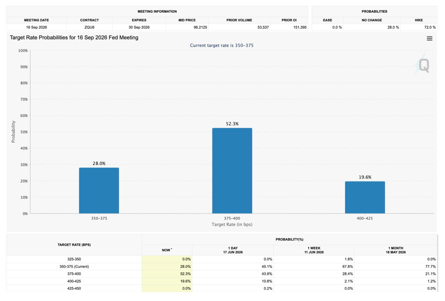
If we dig deeper into the inflation data, stripping out energy does not make the problem go away. Core CPI rose 2.8%, its third consecutive month of acceleration. That tells us the inflation pressure is not simply a function of soaring energy prices; it signals an economy running hot. Unsurprisingly, the Fed’s tone has turned more hawkish, with officials signaling a willingness to raise rates if inflation does not subside. As of today, the market is pricing a 70% chance of a rate hike by year-end.
And still, against every one of these macro risks, the S&P 500 corrected just 9.7% and now sits 9% higher than where it stood when the war began. This fact has forced news pundits to scramble to find a reason based on current events, while failing to look at the underlying force the market is taking its cues from.
How Liquidity Drives Markets and the S&P 500
Liquidity is one of the most overused and least understood terms in markets. At its core, it refers to the availability of capital in the system, specifically how easily businesses, consumers, and financial institutions can access cash or credit.
In today’s global economy, liquidity is inseparable from debt dynamics. It is not the creation of new debt that dominates capital flows, but the ability to roll over existing obligations. Roughly three of every four global financial transactions relate to refinancing, not expansion, and nearly 80% of global lending now requires collateral, typically high-quality, low-volatility assets like U.S. Treasuries.
This creates a framework where liquidity, and by extension risk appetite, is dictated by how cheaply and easily borrowers can refinance without overcollateralizing. The more capital that process frees up, the more can rotate into risk-on assets like Bitcoin.
A number of variables influence liquidity conditions: Central bank policy, Fiscal spending, The Treasury General Account (TGA), Federal Reserve repo operations, Broad equity market performance, Bond market volatility
Collectively, these forces determine whether capital and confidence flow into the system or are pulled out. But among all of them, the most powerful and persistent driver of global liquidity is the U.S. Dollar.
Roughly 64% of global debt is denominated in dollars, which means foreign borrowers who tapped cheap U.S. capital must keep sourcing dollars to service that debt. When the dollar weakens against their local currencies, less local currency is needed to meet those dollar obligations, freeing up capital to chase higher-yielding risk assets.
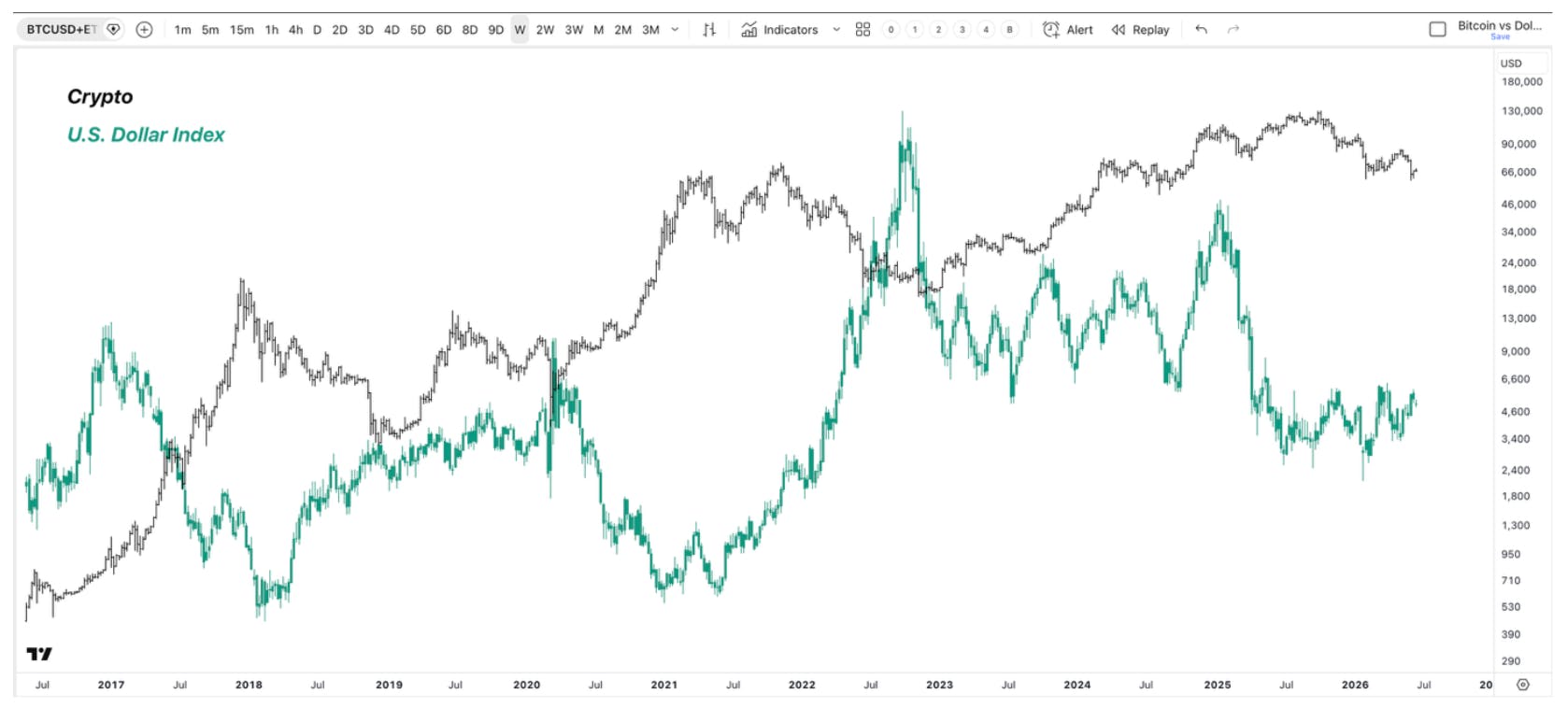
This inverse relationship between the U.S. Dollar Index (DXY) and risk assets is easy to see in the chart below. The black line is a composite of Bitcoin and Ethereum’s price action. Crypto sits at the margin of risk assets, and it is usually where liquidity undulations hit first. The green line is DXY, an inverse proxy for global liquidity. As shown, major trends in risk assets and the dollar tend to move opposite one another.
Oil Trade and the Flow of U.S. Dollars
Global liquidity is a powerful force, and the Iran War threatened it. The danger for equities was never the war itself, or even the spike in oil prices. The danger was what those events could have triggered, which was a sharp reduction in global liquidity.
Roughly 80% of all oil transactions globally are priced in U.S. dollars, a constant for decades that continually pushes dollars into the financial system. When the Strait of Hormuz closed, we did not just lose 20% of the world’s oil. We lost the much-needed flow of dollars that those oil purchases would have circulated.
That is why the Treasury Secretary announced that several countries in the region, including the UAE, were requesting dollar swap lines. The message here is that there were not enough dollars in the region to satisfy demand.
This is how a currency crisis can begin. Because most regional debt is denominated in dollars, debtors must acquire dollars to service their interest payments. If they cannot access them, or if demand outstrips supply, they are forced to sell more of their local currency to source the dollars they need. That selling pressure feeds on itself.
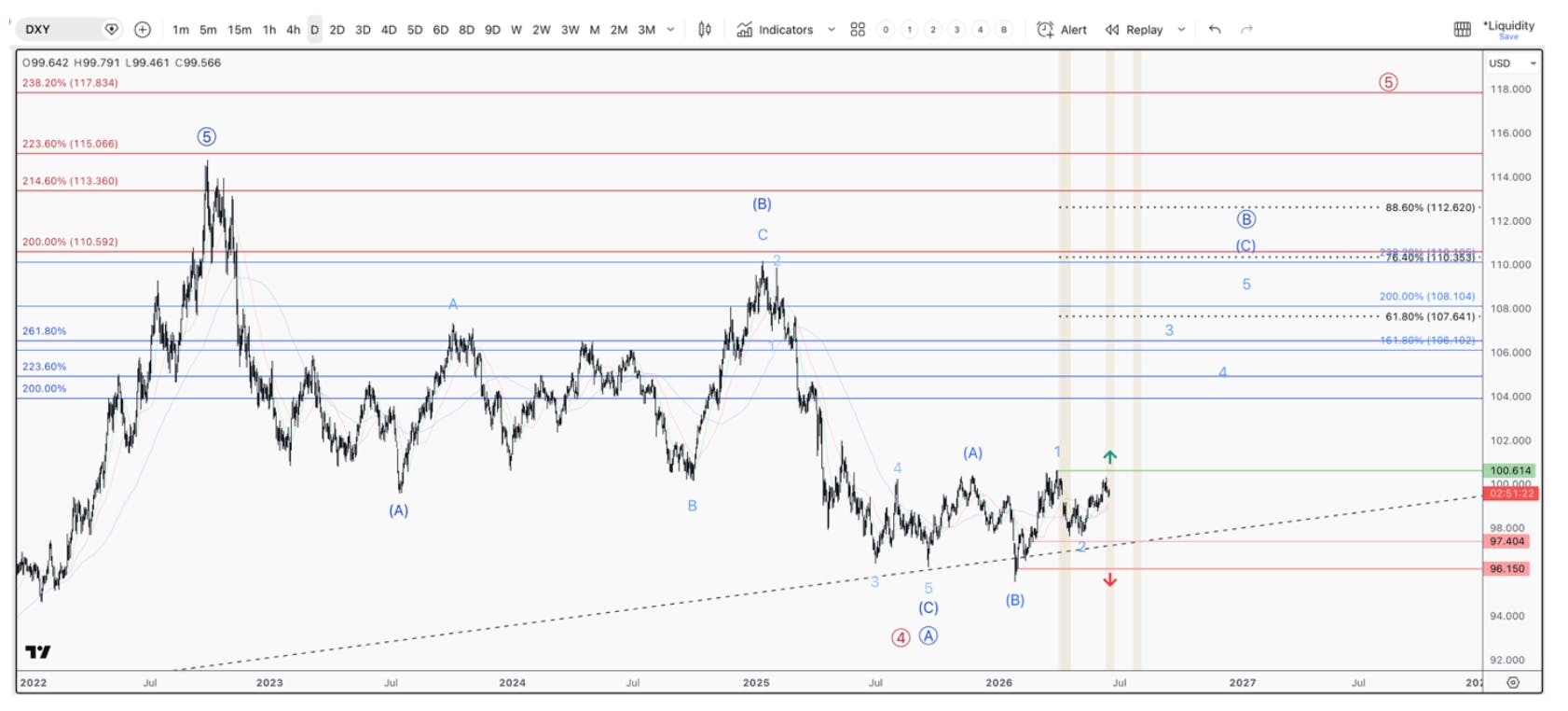
While we are seeing cracks in the global liquidity cycle, so far, an extreme imbalance has not materialized, and DXY confirms it. Since the war began, the DXY is up only 1.8%, nowhere near enough to trigger a liquidity crisis. But the setup is worth watching closely. DXY has just made its first higher high and higher low since January 2025, and the large corrective pattern that began in 2022 appears complete, which suggests a sizable bounce is the next likely move. A break above the key level would trigger a vertical push higher and sap global liquidity in a dangerous way.
Crude Oil Setup: A Key Signal for Market Risk
Interestingly, the same setup is in play in crude oil. The move up off the December 2025 low is a clean three-wave advance, and what has followed is another three-wave move lower that appears to be in its final swings.
Note how volume fades the lower we go, with momentum sitting at one of the most extreme oversold readings in crude’s history. Sellers are exhausting themselves, and momentum does not stay this depressed for long. If the bounce holds under $87, the pattern points to one more drop toward $67 to $70 to complete it. If instead we push above $87, it signals a new uptrend is likely underway, which would not be good for risk assets.
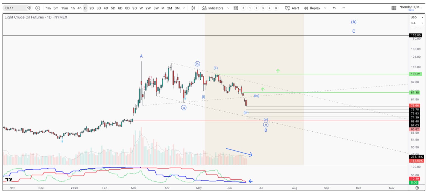
The market is pricing in a transitory move for global oil. In other words, now that the Straight if Hormuz is open, we will get right back to peak production. This is an impossibility based on the nature of active oil rigs turning off temporarily, or what is known as shut in. To bring these rigs back on-line can take anywhere from 2 weeks – to a year, depending on how complex the equipment is. Furthermore, more than 80 energy assets, totaling ~$56 billion in damages. These repairs, as noted, could take up to 2 years.
What’s keeping oil prices suppressed is the 1.1 – 1.3 million barrels being pushed onto the global economy from the US Strategic Petroleum Reserve (SPR). Considering the 300-million-barrel hard floor that must be maintained in the SPR, or else it risks failure, that estimates an inability to suppress oil prices past mid-July, at best.
If this smooth and complex transition is unable to happen, the setup in the chart will likely trigger higher, sapping the global dollar demand further and greatly affecting global liquidity.
Record Market Divergences Beneath the Surface
These setups sit within two macro factors that feed directly into global liquidity. But liquidity is not the only warning light flashing. We are also witnessing some of the most extreme divergences on record.
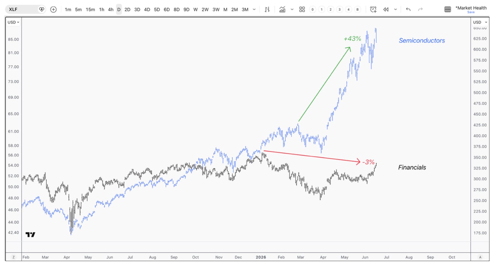
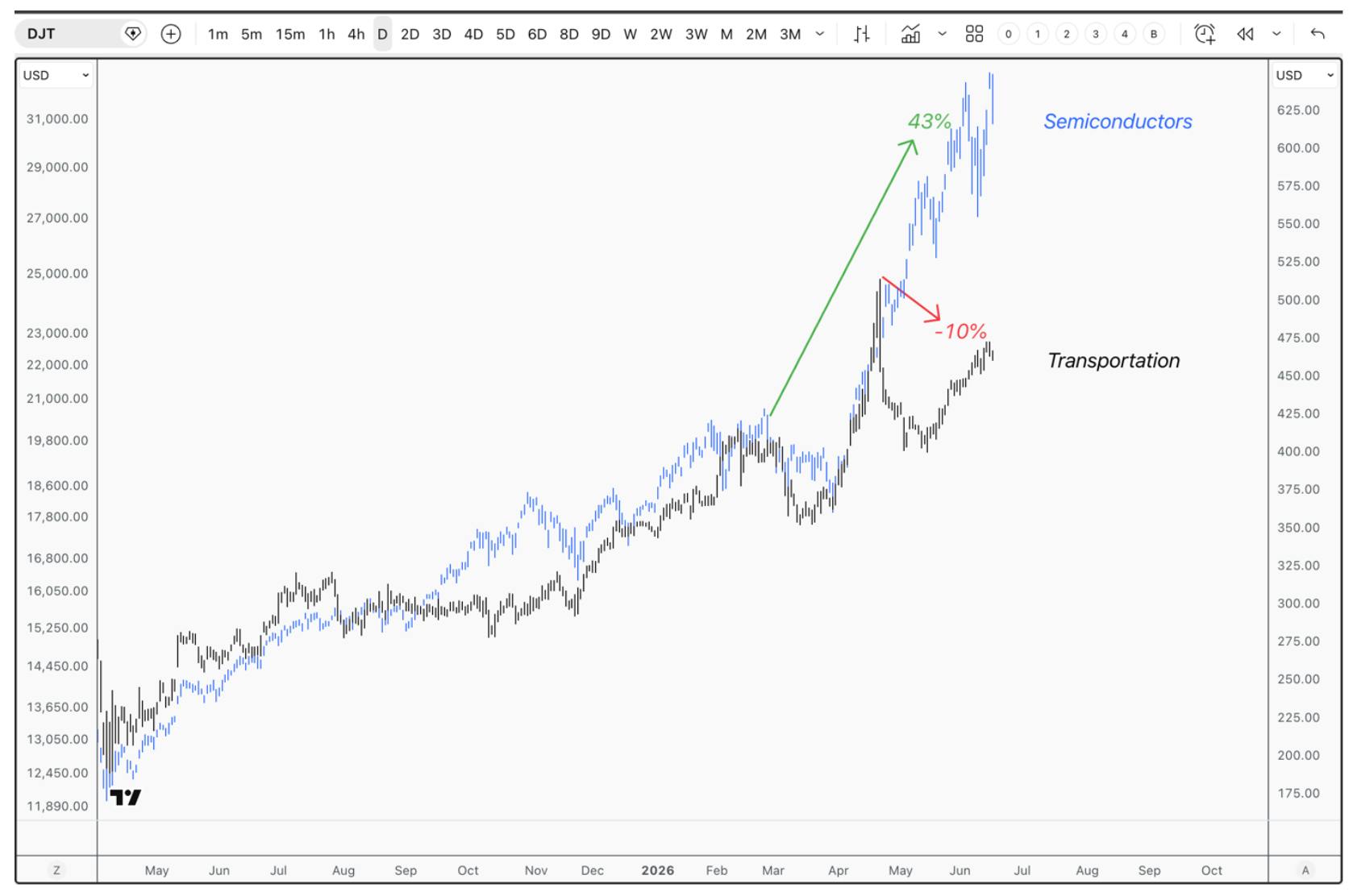
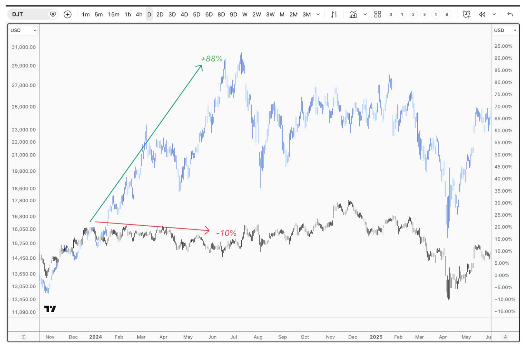
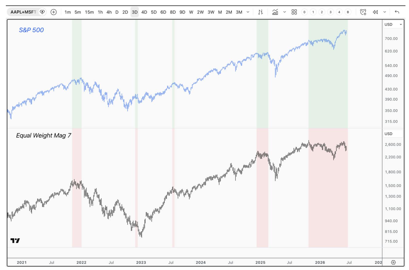
When markets move in unison, it usually marks a strong trend that lasts for many months. But markets rarely top and bottom all at once. There is almost always one market running ahead of the one everyone is watching, and that leader can offer early clues about the next major move.