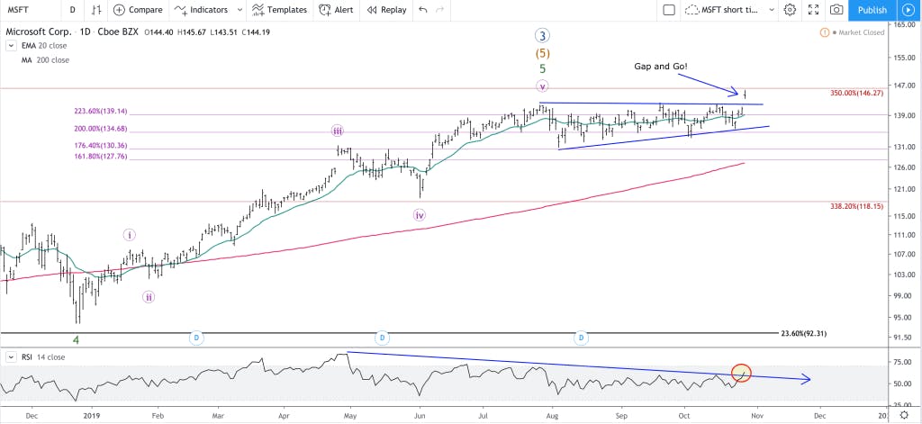


Unlike most tech stocks, Microsoft’s stock price has over 30 years of trading action to analyze. With more data to analyze, I tend to lean heavier on Elliott Wave theory to predict Microsoft’s future. stock price because of the many layers of wave patterns that will naturally unfold over time.
This is a guest post provided by Technical Analyst, Knox Ridley
This article will lean exclusively on Technical Analysis as we start from a monthly chart and zoom into a daily chart to reach the conclusion that Microsoft’s stock price may have some upside left in the trend, but a sharp decline is in the near future, followed by a multi-year renewed uptrend.
Multi-Decade Picture of Microsoft’s Stock Price (monthly charts)
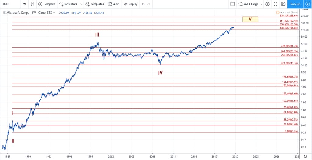
The red extensions are based off the length of Wave I, and then placed at the base of Wave II. The extensions are thus measurements of Wave 1 combined with the internal Fibonacci Ratios (outlined on the right of the chart).
Above is the monthly chart on Microsoft’s stock price going back to its IPO. We have a massive 5-wave pattern unfolding that perfectly aligns with Fibonacci ratios. The exact ratios we use on a daily chart are thus present on a monthly chart, and if you follow the ratio lines in red, you can easily see how the price reacts to these specific levels. It’s because of this that I lean on Elliott Wave as an estimation for the overall direction of Microsoft’s stock price, especially when we can analyze so many layers, and especially considering we are on the final leg of a 30 year 5-wave cycle.
Also Read : Why Microsoft (Not Amazon) Will Win the Pentagon Contract
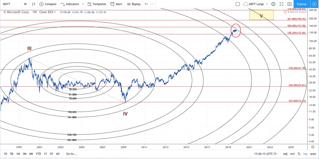
The red extensions are based off the red cycle count that started at MICROSOFT’s IPO. The Fibonacci circles are based off the 3rd wave high and the 4th Wave low.
Not only can we use Fibonacci ratios to estimate support and resistance zones, but we can also use the same ratios to gauge the timing of an uptrend. I only use this technique on large trends, but as you can see above, Microsoft’s stock price tends to warp, bend and react to these levels, as well. In some instances, they act as strong resistance and support.
From my estimation, the price is coming to an inflection point between time and price. The price is moving closer to the 400% resistance circle in black, and is currently hovering between the red 350% and 338.2% price levels in red.
I’m expecting Microsoft’s stock price to make a distinct move within the coming weeks as we approach this inflection point. Either the price will turn down in a corrective fashion, or after bouncing around the resistance levels, we should see the price continue to the next level.
2009 Bull Market (weekly chart of stock price)
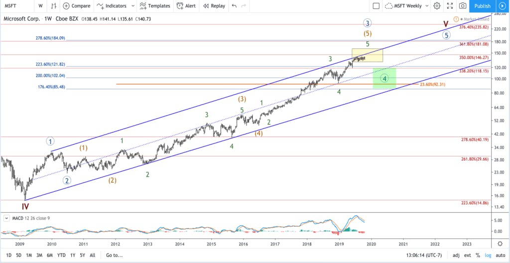
Each count has its own internal extensions, which match the color of the count. Red indicates the extensions of the large cycle count, blue represents the primary count off the 2009 low, and the orange represents the retrace level of 3rd wave within the primary count.
If we dive deeper into Microsoft’s price action on a weekly chart, we can see the uptrend from the 2009 low until now. Keep in mind, the large cycle uptrend that started from the IPO, which is highlighted in red, is composed of its own 5-wave structure. Since 2009, we have been in the final 5th wave of the red cycle count, and that count is comprised of the 5-wave primary count, which is highlighted in blue, circled numbers.